Page 1 of 1
TAILS update
Posted: Fri Jun 08, 2007 8:19 -0700
by Andy
This is my first attempt at using the Ames lettering guide. The first page is a little rough, but I think I got the hang of it. Unfortunately, I'm using cheap markers to letter for now. When I get some money, I'd like to get some of the lettering pens Stan uses.
Let me know what you think!
http://andrewwales.com/computers1.jpg
http://andrewwales.com/computers2.jpg
http://andrewwales.com/computers3.jpg
Posted: Tue Aug 07, 2007 15:27 -0700
by Andy
These are my first strips to be lettered with Rotring pens. Still a little rough, but I like them better than with mechanical computer letters. I hope to get better at it as I go along.


If you want to see them bigger, you can visit
http://www.andrewwales.blogspot.com/
Posted: Tue Aug 07, 2007 15:34 -0700
by Andy
Here is one of my T.A.I.L.S. drawings colored by my son using Photoshop. I think he did a pretty good job for a 16 year old. He is also starting his Eagle project for Boy Scouts. When he completes it, he'll be an Eagle Scout.
The drawing feature T.A.I.L.S. agents Professor Muenster (genius mouse inventor), Acorn John (the chipmunk archer) and Mister Quick (turtle that wears a jet pack).

Posted: Wed Aug 08, 2007 17:56 -0700
by Bryan Stone
hey andy, your lettering is looking good! I've recently discovered the 'B' and 'C' family of nibs are great for lettering! ...mostly I use the good ol' Deleter G-nib.
Another recent lettering discovery, Todd Klein's blog:
http://kleinletters.com/Blog/
Posted: Wed Aug 08, 2007 21:04 -0700
by Stan Sakai
Andy wrote:Here is one of my T.A.I.L.S. drawings colored by my son using Photoshop. I think he did a pretty good job for a 16 year old. He is also starting his Eagle project for Boy Scouts. When he completes it, he'll be an Eagle Scout.
The drawing feature T.A.I.L.S. agents Professor Muenster (genius mouse inventor), Acorn John (the chipmunk archer) and Mister Quick (turtle that wears a jet pack).
Your lettering looks very good. The Aames guide is working for you.
One criticism I have about the art is that all your characters look about the same size in each panel. Vary it a bit with some close-ups, distance shots, even a silhouette or two, etc. Also, for the most part, their faces are shot from the same angle--Schwartz (the warty one--I love that pun) is always full face, and the other is usually 3/4.
Has your son decided on his Eagle project yet? My Matthew is also 16 and has three merit badges before his project.
Posted: Sat Aug 11, 2007 10:20 -0700
by Andy
Stan,
Thanks so much for the feedback. I'll consider it an assignment!
My son's Eagle project will involve scraping, caulking and painting the church windows where our scout troop meets. It's a huge job, but the church has been very generous to our troop. Daniel met with the council rep who approved his project, which means he can begin it. He urged him to take this opportunity to show leadership, which he's doing so far. His job is to mobilize the troop and others to complete the project with him. He's solicited area businesses for donations to finance it, and Walmart and Lowe's donated about $130 worth of paint, etc. He's a great kid, but often requires dad's (ahem) gentle reminders to get to the next step.
We just attended the Eagle ceremony of another of our scouts and it was very inspirational to us as Dan is rounding the back stretch of his trail to Eagle. I've always felt that scouts provides something that American culture lacks: we are one of the few cultures that do not have a ritual whereby we say to a young man, "Now you are a man."
Next, we try to help little brother David become a Star scout. Our troop camps about once a month, even at "Polar Bear" campouts when it's below zero.
Posted: Sat Aug 11, 2007 10:22 -0700
by Andy
Bryan,
Thanks for the encouragement and for the lettering tips and blog resource. I'll definitely have to check that one out.
T.A.I.L.S. Comics #42: "Let's Get Truckin'!"
Posted: Sun Sep 16, 2007 13:07 -0700
by Andy
Posted: Sun Jan 13, 2008 17:41 -0700
by Andy
Your lettering looks very good. The Aames guide is working for you.
One criticism I have about the art is that all your characters look about the same size in each panel. Vary it a bit with some close-ups, distance shots, even a silhouette or two, etc. Also, for the most part, their faces are shot from the same angle--Schwartz (the warty one--I love that pun) is always full face, and the other is usually 3/4.
Stan, I appreciate your advice! The comic strip that follows is my attempt to mix it up a bit. I also was inspired by "Wally Wood's 22 Comic Panels that Almost Always Work".
http://joeljohnson.com/archives/2006/08 ... ds_22.html
[/url]


[/img][url]
Posted: Sat Mar 15, 2008 9:30 -0700
by Andy
Posted: Sun Sep 21, 2008 7:09 -0700
by Andy
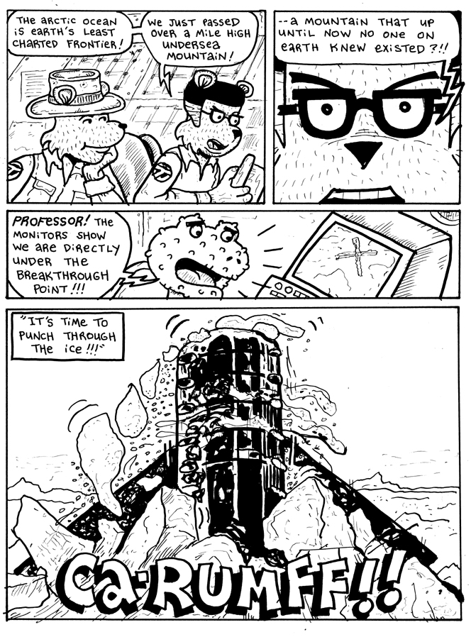
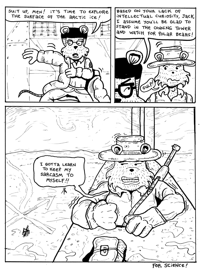
Latest TAILS comic strip --
These comic strips are simple, have just a few facts, and hopefully a little chuckle. They take an unbelievably long time to make. The topic is assigned to me, in this case: Arctic. Okay, with a subject that broad, what do I include? First, I read everything I could find about scientists in the arctic. No ideas. Then someone donated to me about 100 back issues of National Geographic! Hallay-loo-yah! What a goldmine! This comic strip is inspired by a true scientific expedition. Then from start to finish it took about 8 hours to complete. This will appear in an upcoming issue of Boy's Quest magazine.


