
Oh you beautiful bastid, Usagi...that is exactly why you're a hero.
IDW Usagi Yojimbo #4 Spoilers
Moderators: Mayhem, Steve Hubbell, Moderators
IDW Usagi Yojimbo #4 Spoilers
"I'm no hero...I just try to do what is right."
Oh you beautiful bastid, Usagi...that is exactly why you're a hero.
Oh you beautiful bastid, Usagi...that is exactly why you're a hero.

-
jabba359
- Daimyo <High-Ranking Lord>
- Posts: 2058
- Joined: Tue Jan 22, 2013 1:55 -0700
- Location: North Hollywood, CA
- Contact:
Re: IDW Usagi Yojimbo #4 Spoilers
That was also the line that stood out to me when I read it.estee wrote:"I'm no hero...I just try to do what is right."
I'm really loving the colors in these first 4 issues. Tom is doing fantastic work and has completely wiped away any reservations I had about the switch over to color. I'm still hoping we get a limited edition in black and white for each trade or something like that, just so I have the option to read the stories in retro
Also, I have to give a major thumbs up to Ruth's "Story Notes" in the back. It was a very interesting read and I think I'll check out the books Murasaki Shikibu wrote.
-Kyle
Re: IDW Usagi Yojimbo #4 Spoilers
Yeah, that was very cool. Made me look up the Tale of Genji and I came across this neat little video on the BBC.
http://www.bbc.com/culture/story/201908 ... irst-novel
http://www.bbc.com/culture/story/201908 ... irst-novel
-
maichan
- Hatamoto<Special Retainer>
- Posts: 2596
- Joined: Fri Jul 22, 2011 23:04 -0700
- Location: On the path of Bushidō
- Contact:
Re: IDW Usagi Yojimbo #4 Spoilers
jabba359 wrote:Also, I have to give a major thumbs up to Ruth's "Story Notes" in the back. It was a very interesting read and I think I'll check out the books Murasaki Shikibu wrote.
Ruth's notes also sparked my interest. I started looking for what's available in English on Amazon, but it's always a bit confounding with the varied choices when I can't hold an actual copy. If either of you wind up buying a copy, please let us know which version you went with and how you like it.leonid wrote:Yeah, that was very cool. Made me look up the Tale of Genji and I came across this neat little video on the BBC.
http://www.bbc.com/culture/story/201908 ... irst-novel
Re: IDW Usagi Yojimbo #4 Spoilers
The University of Adelaide maintains a beautifully curated collection of free public domain classics in all ebook formats (including Html just for reading in a browser if that is your choice). I've read a few books from there before so naturally, I checked there again. I was not disappointed.maichan wrote:If either of you wind up buying a copy, please let us know which version you went with and how you like it.
https://ebooks.adelaide.edu.au/m/murasaki-shikibu/
https://ebooks.adelaide.edu.au/m/murasa ... -of-genji/
This translation is by Edward G Seidensticker, which seems to be a preferred translation. I went digging around in my library to see which is a better translation and came across an old Economist article which says this.
"Arther Waley, a British scholar also known for his translations of Chinese literature, published his version from 1925 to 1933. It was his limpid prose that brought 'Genji' to western readers, as they re-examined Japanese culture after the second world war. An American author-translator, Edward Seidensticker, produced a fuller translation in 1976, using a matter-of-fact voice akin to Murasaki's own. He is the preferred version in the United States today".
-
Maka

- Daimyo <High-Ranking Lord>
- Posts: 3498
- Joined: Sun Mar 09, 2003 20:10 -0700
- Location: California
Re: IDW Usagi Yojimbo #4 Spoilers
SPOILERS ALERT
I finally got my copy today.
I love the zombie fight scenes. So much slicing zombie’s into different pieces, I like the visuals (with no blood). And these zombies seem to move quickly. The leader jumping down in midair to attack our hero is wonderful.
My favorite lines were two:
“Will you?”
“I cannot stop writing as I cannot stop breathing! It would be the death of me.”
Lady Mura’s facial expressions are tired and sad.
“We all need heroes!”
Again, Lady Mura’s eyes looking at Usagi (off screen) are so expressive. A beautifully sad yet uplifting panel.
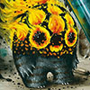
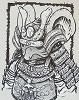
I especially love this cover. So stylized. I love every detail, down to the Japanese slipper socks. This cover with next months would look awesome on someone’s wall.
Request Dogu poster ideal!
I too am loving he additions of colors Tom Luth’s color.
Peace, maka
I finally got my copy today.
I love the zombie fight scenes. So much slicing zombie’s into different pieces, I like the visuals (with no blood). And these zombies seem to move quickly. The leader jumping down in midair to attack our hero is wonderful.
My favorite lines were two:
“Will you?”
“I cannot stop writing as I cannot stop breathing! It would be the death of me.”
Lady Mura’s facial expressions are tired and sad.
“We all need heroes!”
Again, Lady Mura’s eyes looking at Usagi (off screen) are so expressive. A beautifully sad yet uplifting panel.
I especially love this cover. So stylized. I love every detail, down to the Japanese slipper socks. This cover with next months would look awesome on someone’s wall.
Request Dogu poster ideal!
I too am loving he additions of colors Tom Luth’s color.
Peace, maka
-
jabba359
- Daimyo <High-Ranking Lord>
- Posts: 2058
- Joined: Tue Jan 22, 2013 1:55 -0700
- Location: North Hollywood, CA
- Contact:
Re: IDW Usagi Yojimbo #4 Spoilers
Agreed on the cover(s). I like that there is a watercolor paper texture look to the cover. I don't know if that texture was a direct scan of the art or a stylistic layer added in post, but it gives the art a very organic feel.Maka wrote:I especially love this cover. So stylized. I love every detail, down to the Japanese slipper socks. This cover with next months would look awesome on someone’s wall.
Request Dogu poster ideal!
P.S. I'm going to guess that it's a layer effect in Photoshop, as it doesn't make sense to use a paper that textured to draw on if it's not getting painted on physically, and I also don't see evidence of the texture on Stan post about creating the cover: https://m.facebook.com/story.php?story_ ... 3351261734
-Kyle
-
maichan
- Hatamoto<Special Retainer>
- Posts: 2596
- Joined: Fri Jul 22, 2011 23:04 -0700
- Location: On the path of Bushidō
- Contact:
Re: IDW Usagi Yojimbo #4 Spoilers
I also like these covers and would love to see them given the poster or print treatment, and on an appropriately textured paper.jabba359 wrote:Agreed on the cover(s). I like that there is a watercolor paper texture look to the cover. I don't know if that texture was a direct scan of the art or a stylistic layer added in post, but it gives the art a very organic feel.Maka wrote:I especially love this cover. So stylized. I love every detail, down to the Japanese slipper socks. This cover with next months would look awesome on someone’s wall.
Request Dogu poster ideal!
P.S. I'm going to guess that it's a layer effect in Photoshop, as it doesn't make sense to use a paper that textured to draw on if it's not getting painted on physically, and I also don't see evidence of the texture on Stan post about creating the cover: https://m.facebook.com/story.php?story_ ... 3351261734
-
lookatyouhacker

- Shugyosha<Student Warrior>
- Posts: 213
- Joined: Wed Jun 05, 2019 10:55 -0700
- Location: Philadelphia, Pennsylvania
Re: IDW Usagi Yojimbo #4 Spoilers
You know, I don't think the Tale of Genji had zombies in it. That sounds less like Murasaki Shikibu and more like Brahm Stoker.
Also, the whole zombie thing reminded me of Traitors of the Earth.
Also, the whole zombie thing reminded me of Traitors of the Earth.
Restriction Number 666 Released! Dimensional Interference Field Deployed! Code SOL! BlazeBlue Activate!