Thanks for saying so Mike, you're a sweety too!
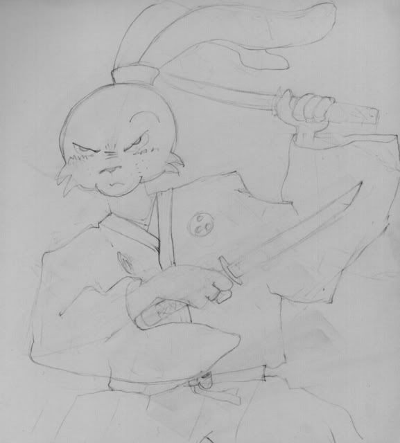
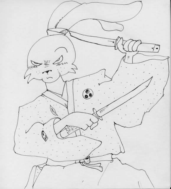
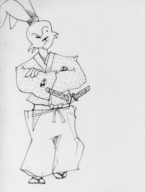
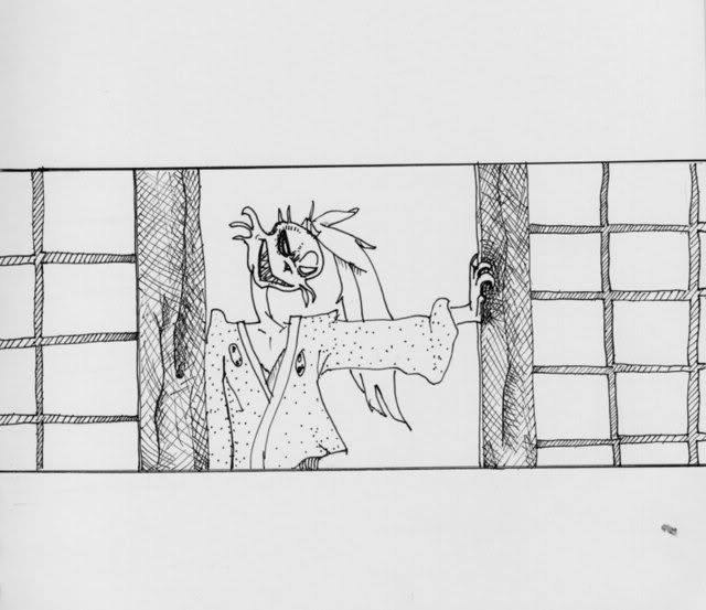
Gary and I were just looking at this thread talking about where I go from here - and why, and trying to figure out why the pencils have so much more zing than the inked stuff. Obviously it's got a lot to do with line weight. I'm attempting to illustrate my point but I am in need of a lot of help with photoshop and can't seem to get it to do my bidding at the moment. For now let's just say that the tension points are way more poignant in the pencils. The ink does show a little of it but tends to have the same line weight no matter what.
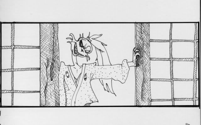
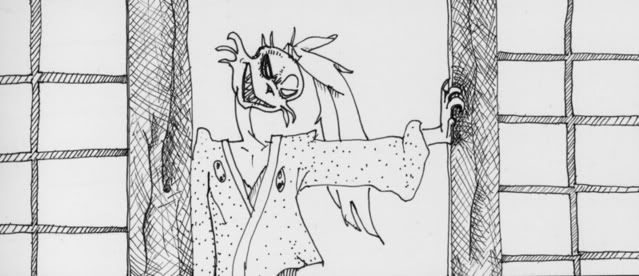
Ah! now we have an illustration thanks to Gary.
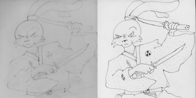
on this scale what strikes me first is the emphasis on the following points: leading edge of the head, upper eyelids, (his) left neck and shoulder and elbow on his kimono, centre where the kimono crosses, his right hand grip, waist band right side, sword tip and grip on his left hand. also de-emphasis on the other sword tip enhancing foreshortening. It's all little stuff but it adds up. I have also come to realize that the pencils have way more information and are thus more satisfying. Somehow Stan doesn't need all the extraneous stuff and flies his drawings on the stark inks alone. I'm in awe yet again.
some of this is pure familarity with the media - I know what pencils do - they're really responsive to pressure so I unconsciously use that when I draw with one. same with graphite or charcoal and conte. Ink markers are weird! They betray you if you rest in one spot... they insist you join your lines PRECISELY - gaaaah! all they know how to deal with pressure is to collapse and go all dry.. It's a different rhythm altogether if it even HAS a rhythm. Ok mystery at least partially solved.
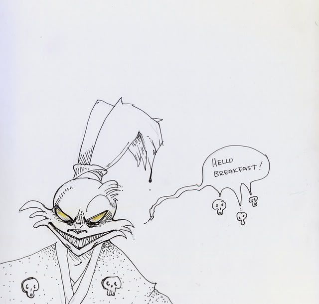
Why does 'breakfast' work... more information - more lines more emphasis.. and mor me in it.